UX Case Study · 2026

A clearer way into SPD's work.

SPD has decades of editorial work, competitions, events, and member resources. The site doesn't make any of it easy to find. We restructured how visitors meet it.

UX Research Information Architecture Heuristic Evaluation Card Sorting Prototyping
Team
Cathy Doss, Giovanni Terzano, Vedang Lambe, Kudirat Alimi
Timeline
11 weeks
Type
Case Study / Project Demo
Methods
  • UX Research
  • Information Architecture
  • Heuristic Evaluation
  • Competitive Analysis
  • Card Sorting
  • Prototyping
01Overview

Strong content, organized for the people who built it.

We didn't rebrand SPD. We restructured how visitors meet it.

Challenge

Strong content, weak structure.

The site felt aimed at insiders. Jargon-heavy categories, overloaded nav, and unclear pathways to membership, jobs, and competitions.

Outcome

An IA redesign, grounded in real visitor goals.

Simplified top-level nav, clearer entry points, and a homepage that orients new visitors. Three core flows prototyped end-to-end.

Goal

Make the work findable.

Same content, better access. Reduce hunting, surface the actions visitors actually came to do, and let SPD's editorial credibility speak.

02What exists now

Understanding the current site.

Strong content. Weak structure. Before talking to users, we audited what the site was already doing. Three artifacts surfaced the recurring pattern.

Audit · 01

Heuristic Evaluation

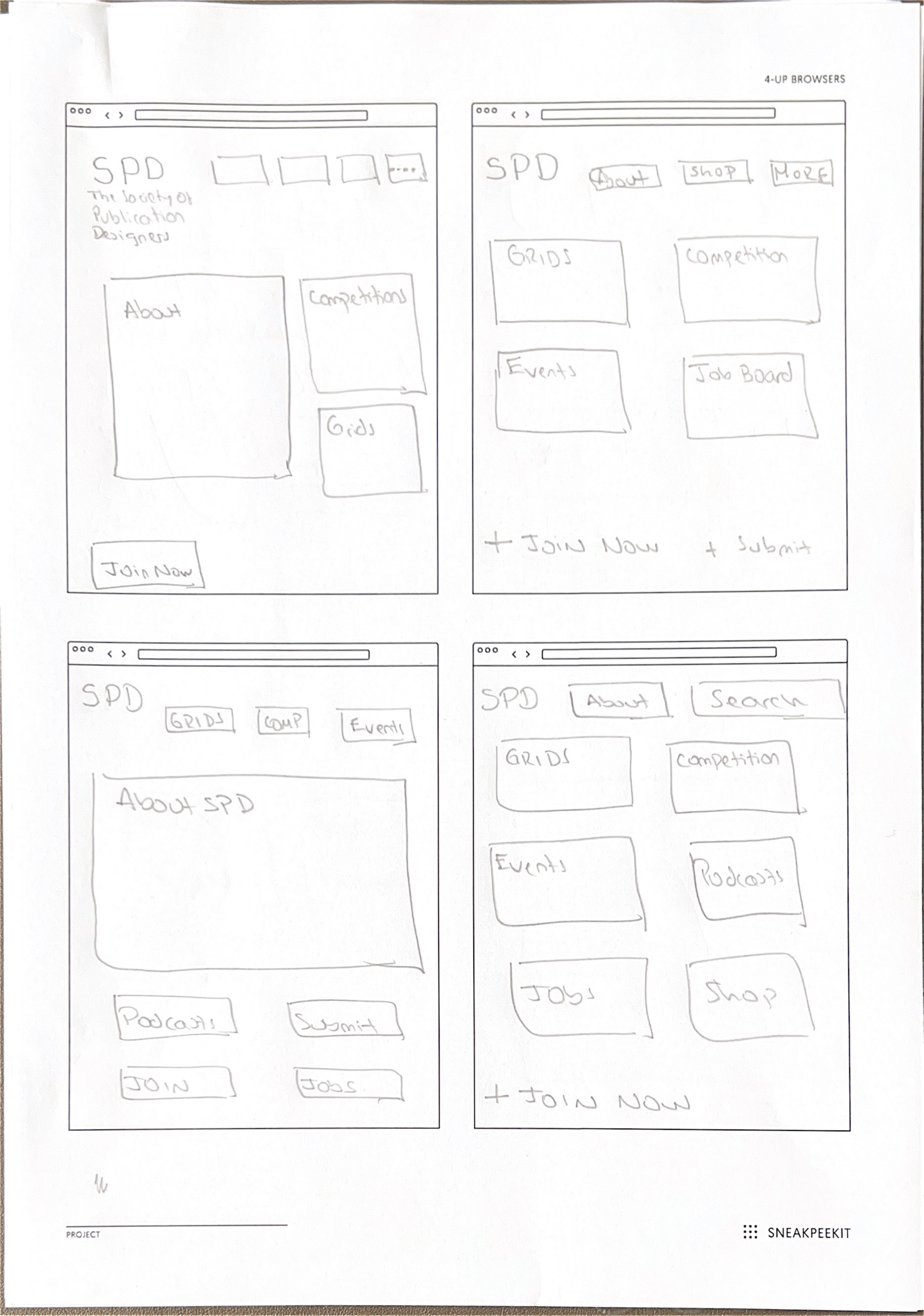
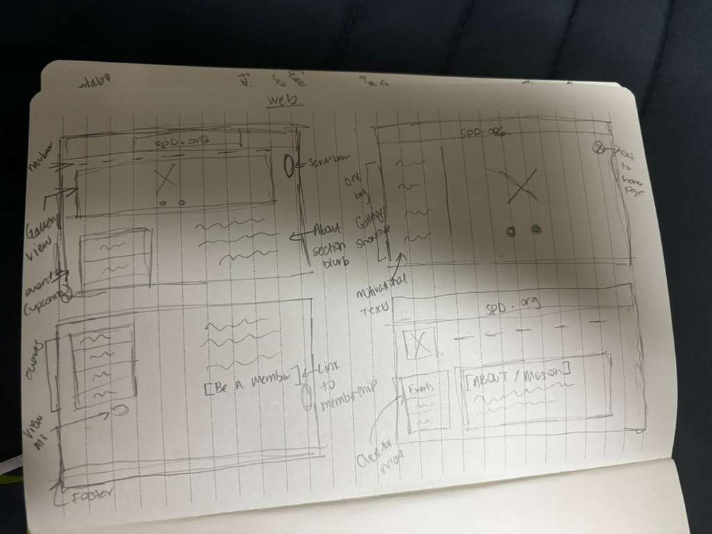
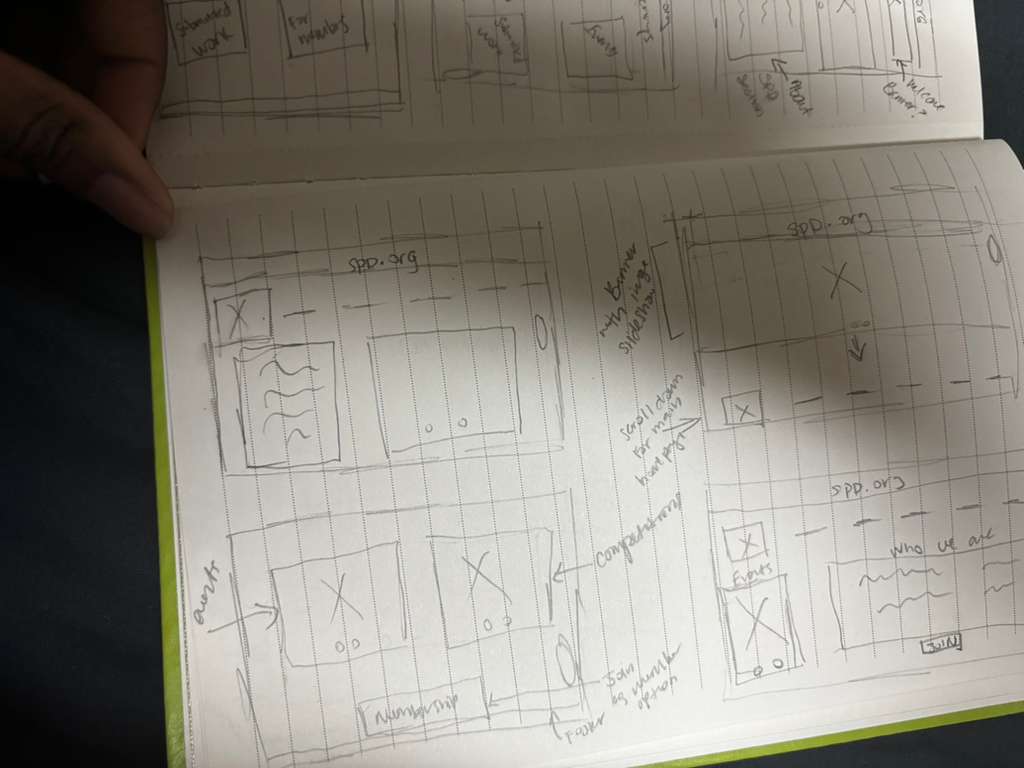
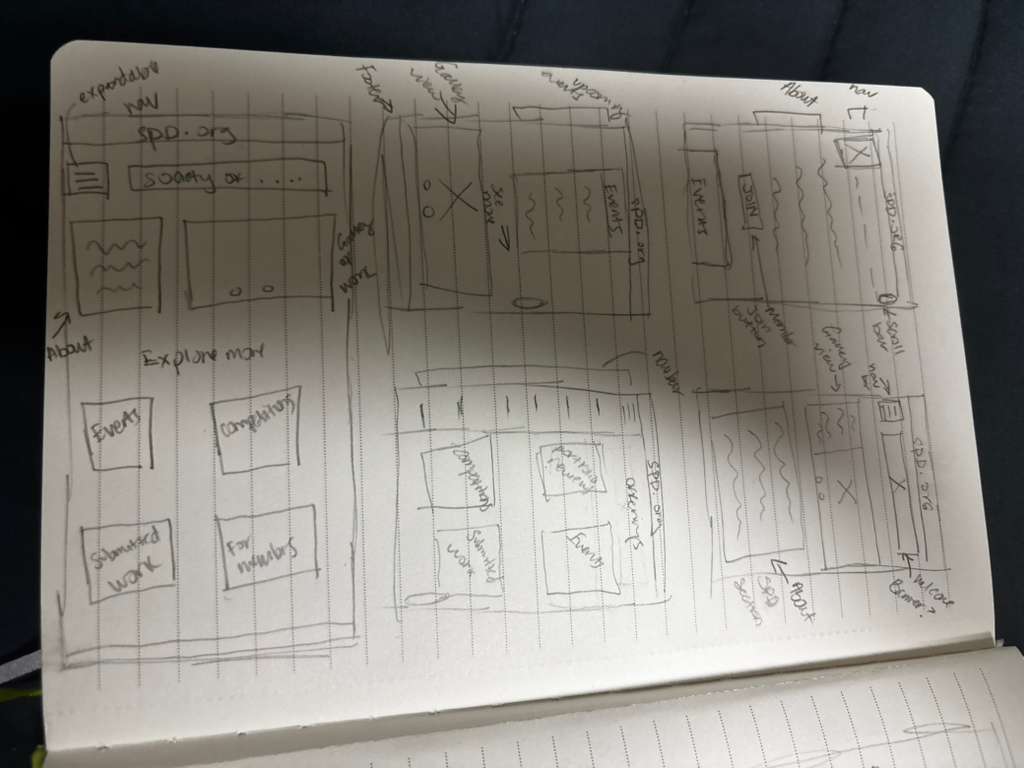
Nielsen's ten heuristics, applied to web and mobile. Ten recurring violations — system-level, not polish.

What it told us

Issues clustered around navigation clarity, consistency, and recognition over recall — the same structural problem in different places.

Why it mattered

It proved the redesign needed to focus on information architecture, not visual polish.

Heuristic evaluation
Audit · 02

SWOT Analysis

Audit findings, translated into risks and opportunities. Strong content, weakened by confusing navigation.

What it told us

SPD's biggest strength is credibility and content; its biggest risk is that visitors can't reach that value.

Why it mattered

It reframed the project from "fixing a website" to surfacing SPD's existing value.

SPD SWOT analysis
Audit · 03

Competitor Analysis

SPD compared with AIGA NY, TDC, and D&AD. Usable peers lead with action, not categories.

What it told us

Peer sites made major user actions easier to identify — the path to membership, jobs, or events was visible from the homepage.

Why it mattered

SPD was the outlier: it buried key actions and gave too many categories equal weight. That set the bar for what the redesign had to fix.

The site already had everything it needed. It was in the wrong shape. From audit synthesis

03Methods

Triangulating the problem.

Three angles on the same site. We paired user interviews with task analysis so we could compare what users said against what they actually did. Click any card for details.

04Patterns

Quantifying the friction.

We used survey and data synthesis to check whether the issues we heard in interviews were showing up more broadly. The patterns lined up — the friction was structural, not anecdotal.

0 +
Top-level nav categories one participant counted on the existing site — before counting sub-items.
0 /4
Interviewees couldn't articulate what SPD does within the first few seconds of landing on the homepage.
0 +
Extra clicks needed on average for users to complete the four core tasks against the existing site.
Friction themes · how often each surfaced across sources

Where the breakdowns clustered.

Overwhelming navigation
Every source flagged it.
Homepage doesn't orient
Reads as a feed, not a homepage.
Membership value invisible
Couldn't explain what $50/yr buys.
Insider labels confuse
"First Love," "Credits," "Spreads of the Day."
Audience feels narrow
Skews print-only, alienates adjacent creatives.
What this showed us

The confusion we heard in interviews wasn't isolated. Users consistently struggled with orientation, navigation, and understanding SPD's value — across roles, career stages, and sessions.

Why it mattered

It gave us confidence to focus the redesign on structure and discoverability, not visual polish. Every top-level decision in the new nav traces back to a pattern above.

05Insights

What we kept hearing.

Five frictions surfaced across interviews and task analysis. Not about polish. About people not understanding what SPD is, where to go, or what they could do once they got there.

Insight 01
I don't know what SPD is yet.

Visitors couldn't articulate what SPD does or who it's for after looking at the homepage. The page assumes you already know.

Insight 02
The navigation is doing too much.

Eight broad top-level entries with sub-categories. People stopped guessing and used the hamburger menu.

Insight 03
Membership value is hidden.

Users couldn't evaluate whether membership was worth it before being asked to pay. They closed the tab.

Insight 04
Strong content, weak structure.

Every interview noted SPD's editorial work as a positive. The same interviews noted that the site made it hard to find that work.

Insight 05
Insider language creates barriers.

Series names like "First Love," "Credits," and "Grids" mean nothing to a new visitor. The site speaks to people who already know SPD.

It took me at least two clicks to find out who SPD are.
Senior CTO, tech studio
Their strong points is their content. Their weak points is their organization.
Junior designer interview
06Personas

Three real visitor types.

Each one pointed to a different page that wasn't doing its job.

Alex V persona
Alex V28 · Newcomer
Application Developer Analyst, Capital One
What he needs

To quickly understand what SPD does, who it's for, and how to submit work to a competition without getting lost in unfamiliar series names.

Their strong points is their content. Their weak points is their organization.
Maya Chen persona
Maya Chen28 · Mid-career
Brand & Editorial Designer, Brooklyn
What she needs

Freelance gigs, awards she can put on her portfolio, and a clear breakdown of what membership offers before she pays for it.

I need people to sell it to me a little more.
Mike persona
Mike22 · Student
Senior BFA in Design, Los Angeles
What he needs

An obvious starting point. Student competitions, inspiration, and a sense that publication design is a real career path.

I like the vibe, but I got lost trying to actually do anything.
07Process

From cluttered navigation to clearer paths.

The navigation problem wasn't visual clutter — it was unclear prioritization. Card sorting showed which pages users expected to see together; the sitemap showed where important actions were buried. Together, they reshaped the top nav.

Final navigation — desktop

Five destinations across the top.

Job Board surfaces as a primary destination instead of a buried link, with persistent Join SPD and Login on the right.

Final navigation on desktop
Final navigation — mobile

Same paths, hierarchy preserved.

The mobile menu mirrors the desktop nav and exposes the About sub-menu (Membership, Meet the Board, Society Activities, Herb Lubalin Award, Contact) one level down.

Final navigation on mobile
01
MikeStudent designer

"As a student designer, I want a clear starting point, so I can understand where to go without clicking through random sections."

HomepageOrientation, hero, three actions
02
Alex VNew visitor

"As a new visitor, I want to quickly understand what SPD is, so I can decide if it feels relevant to me."

About SPDIdentity, mission, value
03
Maya ChenActive designer

"As an active designer, I want to find roles quickly, so I can see whether SPD is useful before committing to membership."

Job BoardFilterable, not buried
08Sketching

We drew before we designed.

Throwing out compositions on paper, before committing.

Homepage sketches
Homepage explorationSketch 01
Web sketch 1
Web layoutSketch 02
Web sketch 2
Nav explorationSketch 03
Mobile sketch
MobileSketch 04
09Low-fidelity wireframes

From research to layout experiments.

These low-fidelity wireframes helped us test layout hierarchy, simplify navigation pathways, and experiment with how users would move through the system before building the final direction.

Low-fi homepage prototype
Homepage Orienting visitors with a clear hero and three entry points instead of a flat content feed.
Low-fi navigation menu prototype
Navigation Mobile menu showing the simplified primary nav and the About sub-menu hierarchy.
Low-fi Job Board prototype
Job Board Surfaced as a first-class destination with filters by date, position, company, and location.
Low-fi Join SPD membership prototype
Join SPD Membership tiers given a real page so the value is visible before the ask.
10Final direction

A clearer homepage. A simpler nav. Real entry points.

Same identity. Tighter structure underneath.

About SPD About SPD wireframe flow.
Job board Job Board wireframe flow.
Navigation Navigation wireframe flow.
Homepage Homepage wireframe flow.
01

Replaced category-based menus with action-based ones.

Top nav becomes Enter, Join, Browse, About. New content has an obvious home, and visitors don't translate categories before they can act.

02

Built shared shapes for recurring page types.

Homepage, competition, winner, event, and member tier each get one consistent layout. Yearly updates ship as content, not new design work.

03

Reworked content-heavy pages to match the decision.

Where the goal is comparison, content sits side by side. Where it's scanning, content breaks into recognizable chunks.

04

Surfaced the actions that bring people back.

Job board, competitions, and membership are first-class destinations now, not buried links inside a generic Resources section.

11Final presentation

A higher-level walkthrough.

Client / demo deck

Final outcomes, in presentation form.

For a higher-level client/demo walkthrough of the redesign, we also created a presentation version focused on the final outcomes.

View presentation ↗
12Result

A dense ecosystem, made navigable.

Same content. Better access. The redesign reorganizes SPD's existing value so users can actually find it.

Then
0
Top-level nav entries
Now
0
Task-led paths
Flows
0
Prototyped end-to-end
Personas
0
Real visitor types
13Reflection

What we learned, what we'd do next.

As a student project, this stops at the prototype. The lessons hold.

What we learned

Visual polish doesn't equal usability.

SPD's site already looks editorial and considered. The problem was structural. Spending design time on the surface would have masked the real issue.

What stuck

IA was the foundation of the redesign.

Once the top-level was task-led, the homepage, About, and job board fell into place. The card sort gave us more leverage than any visual exploration.

What's next

Test with SPD users. Refine membership. Build templates.

Usability testing the prototype with real SPD visitors, fleshing out the membership comparison, and turning the recurring page shapes into a small template system.